



Putting a Face Back Into Hiring
Synkr Came To Us To Make
Job Applications Feel Human Again.
A CV is a poor instrument for the thing it's asked to do. It flattens a person into a list of previous employers, and it gives a hiring manager almost nothing to go on until they're already on a call. Synkr's answer was to put a one-minute video at the front of every application, which sounds simple until you have to design for the person who has never recorded themselves before and is nervous about starting.
Brief To Brand Book
Six Steps, In Order, With Nothing Skipped.
A structured approach to user-friendly solutions through research, ideation, prototyping, testing and refinement.
1. Discovery
Identified pain points in the job application process for candidates and employers.
2. Define
Crafted a problem statement and developed user personas.
3. Ideation
Brainstormed features and created wireframes.
4. Design
Developed high-fidelity prototypes and refined the UI/UX.
5. Testing
Conducted usability tests and iterated based on feedback.
6. Launch
Finalized designs, handed off to development, and collected post-launch feedback.
Synkr is a mobile platform that changes what a job application contains. Candidates build a video-enhanced CV: a short introduction recorded in the app, sitting alongside the usual credentials, and apply to roles directly. Employers get a posting tool, a company profile, and a dashboard that shows how each listing is performing.
The goal was to make applications more engaging on one side and more efficient on the other, without asking either group to learn a new way of working.
Challenge
Asking someone to record a video of themselves is a much larger request than asking them to upload a PDF. The feature only works if the least confident user on the platform will actually go through with it, so the onboarding had to lower the stakes rather than sell the feature.
That produced five constraints that we held the design against:
Inclusive onboarding. A welcoming, guided first run, built for someone who has never done this before.
Seamless navigation. Intuitive movement between recording, browsing and applying, so the video never feels like a detour.
Accessibility. Usable by people with disabilities, which for a video-first product is a real design problem, not a checklist item.
Data privacy. A candidate's face is more sensitive than their CV. Controls had to be legible, not buried.
Engaging visuals. Enough personality to make recording feel low-pressure, without tipping into a product that looks unserious to the employer on the other side.
The second problem was structural. Synkr has two audiences with opposite needs in the same app, a candidate wants to be seen, an employer wants to filter, and one of them will always be the secondary user if the navigation isn't planned around both.
Approach
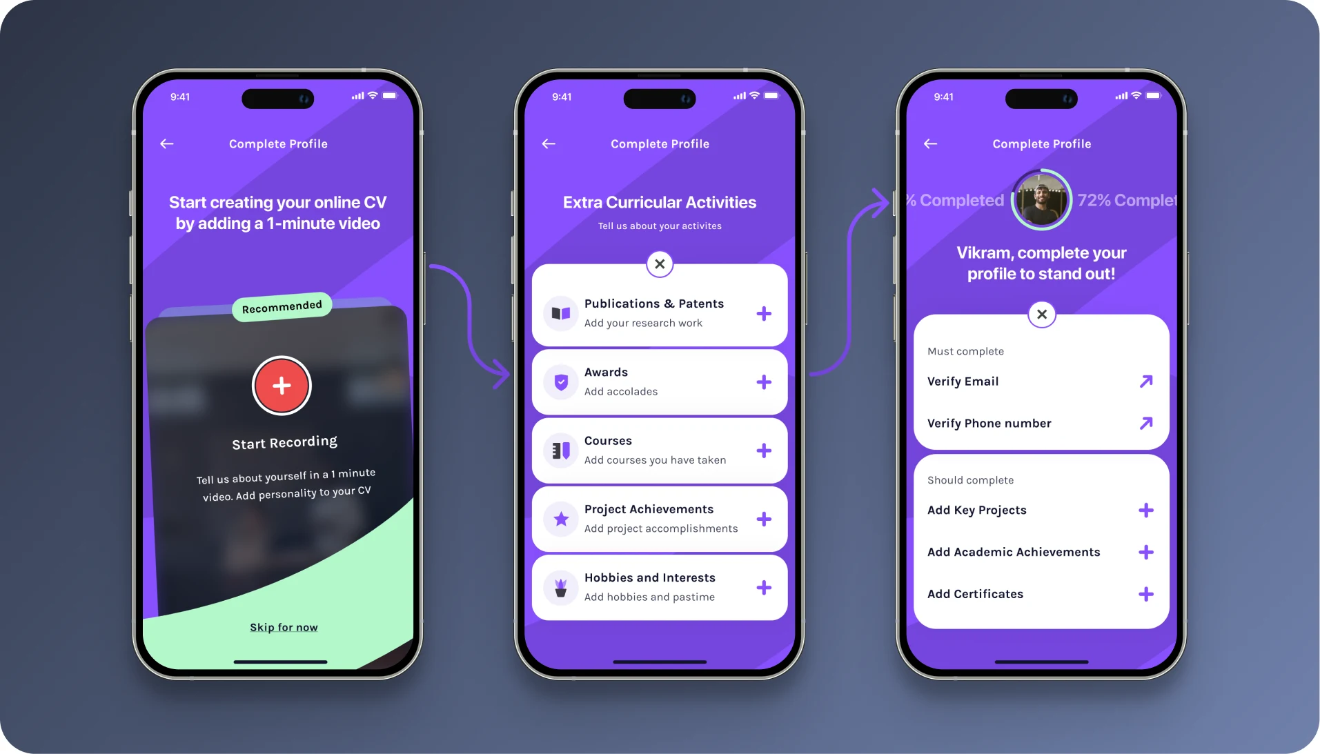
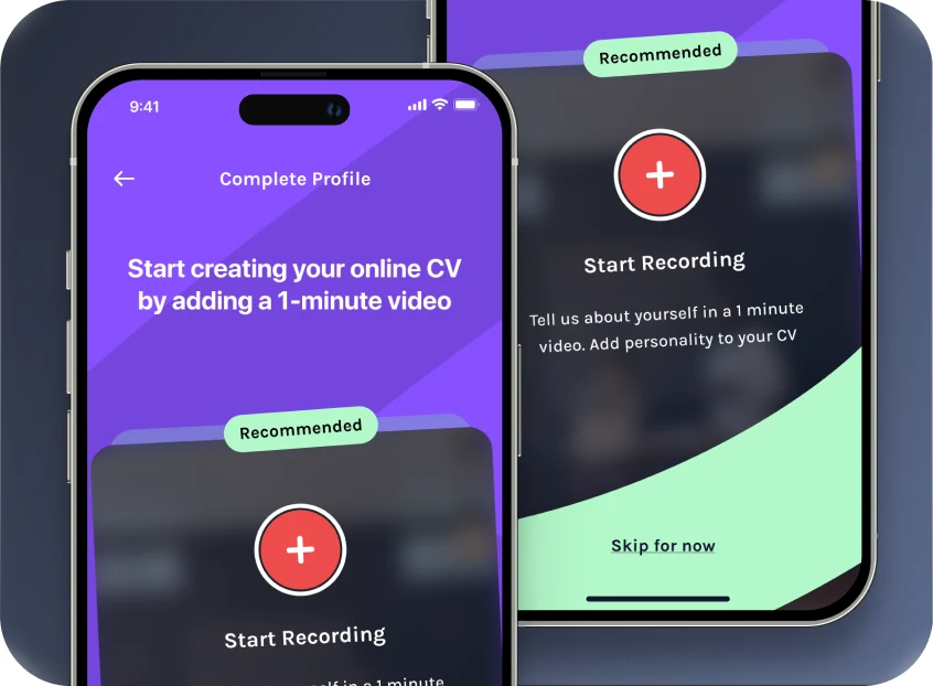
We treated the video as the easiest thing in the app, not the most impressive. The recording screen opens with a prompt, a visible skip, and a one-minute ceiling the limit does more work than any amount of encouragement, because it tells a nervous user exactly how much of a commitment they're making.
Everything else was built around keeping the candidate and the employer out of each other's way. They share a design language and almost no screens. Candidates get a browse-and-apply surface with recommendations up front. Employers get a posting flow and a dashboard with performance numbers on it. The two only meet at the application itself.
The visual system leans on a single saturated purple against near-black, with a mint accent reserved for progress and confirmation. Restricting the accent to moments of forward motion means the interface reads as encouraging without ever saying so.
What The App Actually Does
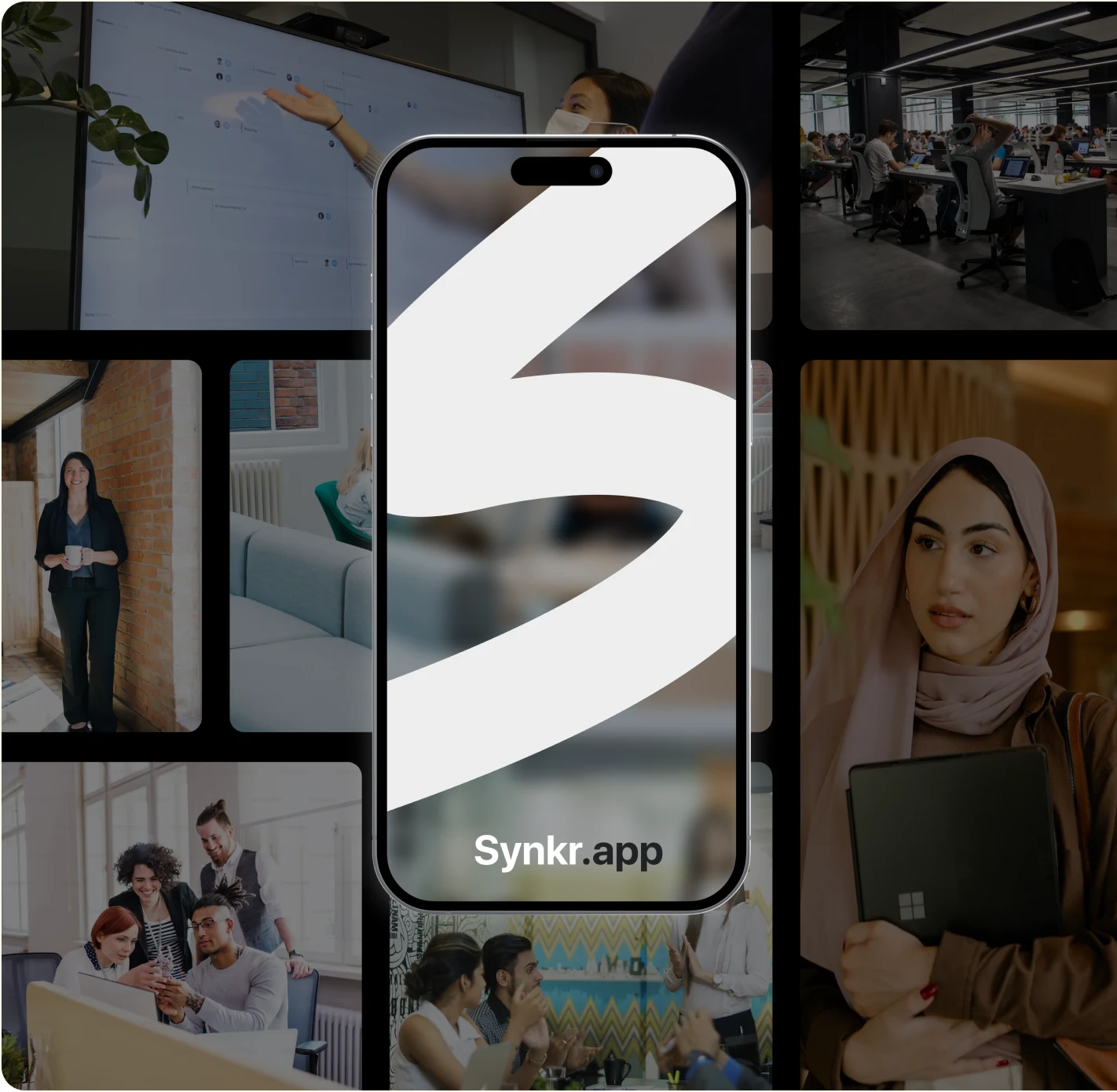
Three features, one idea. Candidates introduce themselves on video, browse companies with real context, and apply with intent. Employers post roles and see what's working. Each part is small on its own; together they replace the paper CV.
A 1-Minute Intro, Recorded In The App
Candidates record a short video that sits at the front of every application, adding the personal context a document can't carry. Capped at a minute, skippable, and re-recordable as many times as it takes.
Enough Context To Apply With Intent
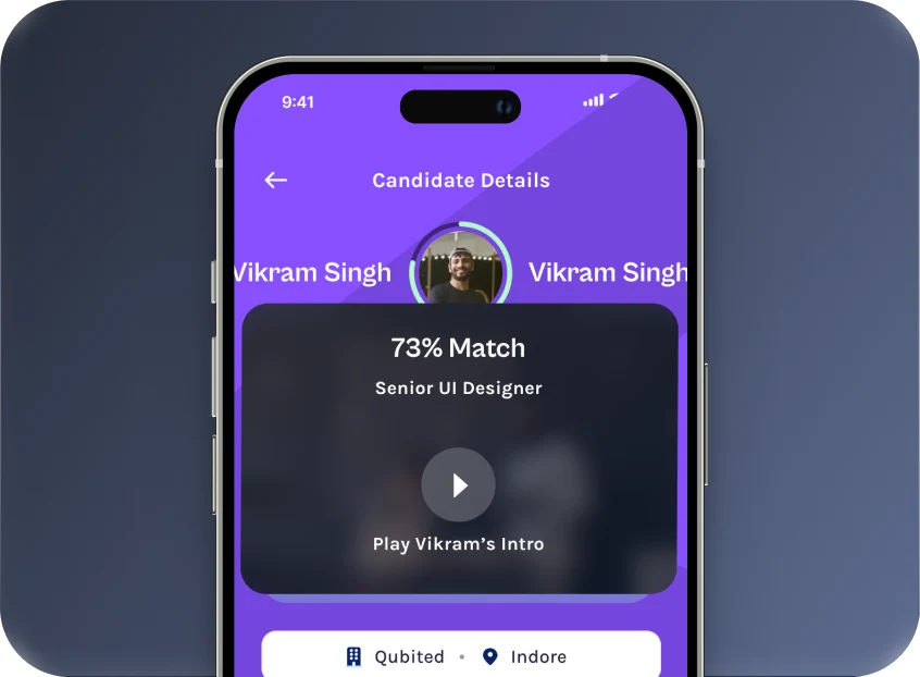
Candidates browse detailed company profiles alongside open roles mission, size, location, recent activity so an application is a decision rather than a numbers game.
Post, Review, And See What's Working
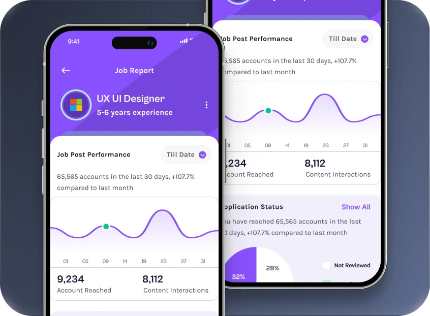
Employers post roles, review applicants, and track how each listing is performing against reach and response the numbers that tell them whether the problem is the role or the way it's written.
Outcome
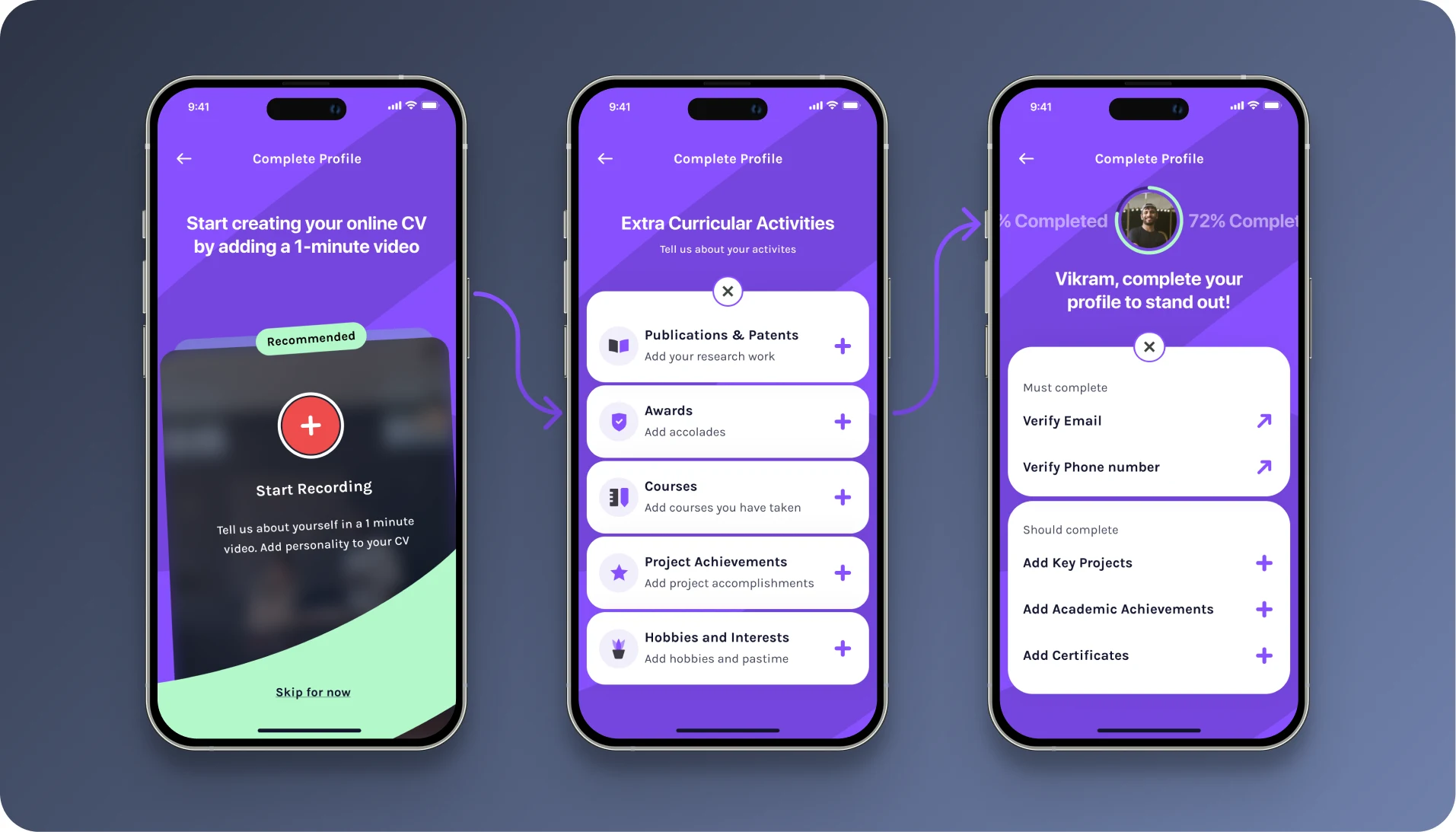
Synkr shipped with a complete design system and a handoff that development could build against without coming back for interpretation every state, every empty screen, every error, specified.
Tech Stack
 Figma
 Adobe Illustrator
 Adobe Photoshop
 Notion