



Making Compliance Feel Like a Person, Not a Process.

Filing Buddy, A Tax And Compliance Service,
Came To Us For An Identity That Felt Approachable.
Tax compliance is a category built on caution. Every competitor looks the same, navy blue, hard edges, a wordmark that could belong to a bank or a law firm. Filing Buddy needed to signal reliability without inheriting that coldness, because the promise of the business is that someone else carries the burden for you.
Brief To Brand Book
Filing Buddy provides tax filing, GST, ROC and compliance management for businesses and individuals across India. The service exists to absorb the parts of compliance that most business owners have neither the time nor the appetite to handle: registrations, returns, filings, deadlines, so they can spend their attention on the business itself.
They approached us with an identity that had been assembled rather than designed: a wordmark, a colour, and no rules governing either. Everything downstream, the website, the invoices, the social posts, the sales decks, was being made up each time by whoever was making it.
Challenge
Filing Buddy's category punishes anything that looks casual. A tax service is asking for access to a business's finances, so the identity has to read as competent before it reads as anything else. But every player in the space had already solved that problem the same way, navy, serif, sharp corners, a lot of restraint. The result is a category where nobody is memorable and nobody is warm.
The brand's actual proposition was the opposite of that austerity. Filing Buddy's pitch is we'll handle it for you, it's a relationship, not a portal. The existing identity communicated none of it.
There was a second, quieter problem. There were no rules. The logo had been redrawn at different proportions in different places, the blue drifted between files, and there was no secondary colour, no defined typeface and no guidance on what not to do. Every new asset was a fresh negotiation, and the brand looked slightly different everywhere it appeared.
Approach
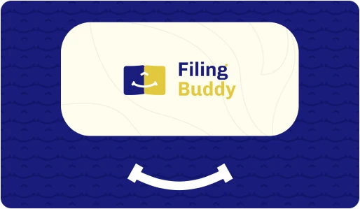
We built the identity around a single idea: the buddy is doing the paperwork, and doing it cheerfully. Rather than describe that in a tagline and hope people read it, we put it into the mark itself.
The logomark carries three elements, each doing a specific job. The book is the paperwork, the filings, the returns, the compliance load. The smile arch is Filing Buddy handling it for you, and it's the element that separates the brand from every navy-and-serif competitor in the category. The upward arrow is the outcome: your company grows because that load moved off your desk.
The colour system does the credibility work so the mark doesn't have to. Deep Blue holds the seriousness the category demands, and it's the dominant colour across the brand. Glow, the yellow, is where the warmth lives, used as the accent and the highlight, never as the base. The two together let the identity be trustworthy and human at the same time without either quality cancelling the other.
Everything was then written down. Construction, spacing, colour values, type scale, backgrounds it can and cannot sit on, and a set of explicit misuse rules so the brand stays the same shape no matter who's building the next asset.

The Identity System
Three elements, one idea. The book is the paperwork. The smile is Filing Buddy carrying it. The arrow is your business moving up because of it. The mark reads as a single shape at small sizes and unpacks into its three parts when you look closer.
The Mark
Three elements, one idea. The book is the paperwork. The smile is Filing Buddy carrying it. The arrow is your business moving up because of it. The mark reads as a single shape at small sizes and unpacks into its three parts when you look closer.
Adhering to the Kanban process, our team methodically progressed through tasks, fostering collaboration between design and development. This approach not only elevated aesthetics but also optimized the website's performance

Colour
A restrained palette built for a category that runs on trust. Deep Blue is the base and carries the weight. Glow is the accent, used sparingly enough that it stays an accent. Off White softens every surface the brand sits on, and Black is reserved for type.
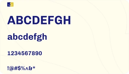
Typography
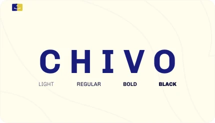
Chivo in Bold and Black. Geometric enough to feel current, heavy enough to hold its own next to a mark this simple. Bold for body and interface, Black reserved for headlines and the wordmark.
Usage
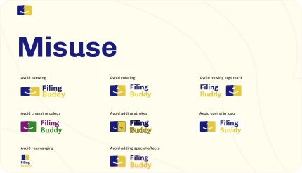
A brand only stays consistent if the rules are boring and specific. The brand book defines clear space, minimum sizes, approved backgrounds, and the monochrome and reversed variants, alongside an explicit list of what the mark must never do: no recolouring, no stretching, no rotating, no effects, no rebuilding the lockup by hand.

Outcome
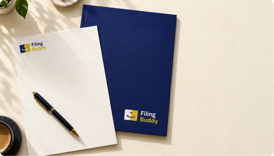
Filing Buddy now has an identity that does two jobs the previous one couldn't: it signals competence to a cautious audience, and it signals that a person is on the other side of it. The mark works at favicon size and on a hoarding, in one colour and in four.
More practically, the brand became reproducible. Anyone building a new asset now starts from a defined system instead of a guess, which is where most of the day-to-day value of a brand book actually sits.


Tech Stack
 Adobe Illustrator
 Adobe Photoshop
 Figma
 Notion